Aligning Buholá's website and product's look & feel with the company values
Aligning Buholá's website and product's look & feel with the company values
From running a "brand deck" exercise to define the brand foundations to implementing the visual style across the website.
Case study
March 1, 2021
My role
Visual and Web Designer
The activities
Brand, Visual, and Web Design
The team
Technical Lead
The tools
Figma, Photoshop, Cinema 4D, and Webflow
Overview
Buholá is a web app that allows freelancers in Mexico to create and iterate estimates, receive advance payments, generate government-certified invoices, and send final deliverables locked against final payment.
We launched Buholá two years ago; the application is a side project where I do Product Design, Brand Design, Marketing, and Front-end Development. The focus of this project was to revamp the look & feel of the application to communicate the brand attributes that my partner and I wanted to transmit through our product and marketing website.
Goal
Redesign our website and launch a marketing campaign with a new look & feel aligned to the product's brand attributes. Translate those attributes into a new style guide and visual assets across different channels, including our main product.
Challenge
There were some discrepancies in how we wanted our brand to be perceived; while my partner wanted to be more formal and professional, I wanted to be more friendly and accessible. The challenge was to find the right combination of attributes and accurately distill them through the visual design of our website and brand.
Process & Solution
The first time I defined the look & feel for our brand, I did it while in the rush to launch a minimum viable product. At that point, it was more important to validate our value proposition than delivering a super polished visual design. Back then, we ensured that the user interface was clean, simple, consistent, and provided enough confidence to users to use our product and pay for it.
A couple of screenshots of our previous visual style
We spotted a couple of issues with the visual style we had chosen through time: the two primary colors didn't combine perfectly, and the overall the look & feel was a bit too informal from our point of view. During multiple discussions, I noticed that my partner wasn't convinced with the look & feel because, in his mind, our brand should be more formal and professional.
With a new marketing campaign on the horizon, I decided to work on a revamp. These are the steps I followed:
Used the brand deck to settle on the attributes of our brand
Translated those attributes into the color palette, our typefaces, and graphic elements
Redesigned our marketing website following the new visual style
Applied our color palette, fonts, and graphic elements to our product
Brand deck
During a 1-hour workshop, we went through a Google Slides version of the Brand Deck: slide after slide, we discussed and agreed on the attributes we associated our brand with, e.g., curious vs. certain, modern vs. vintage, basic vs. high-end. In my day job at Wizeline, my team uses this framework to connect our clients' brand with the look & feel of the products we design for them.
Brand deck after our session
Tension Matrix
A tension matrix helps to visualize the attributes across a two-axis board. We use the tension between two opposite terms to create a brand that has more personality and to define the narrative of the website. Rather than saying "my brand (or product) is bold, progressive, and professional," which are all similar qualities, you could say, "my brand (or product) is professional but practical, is best-in-class but approachable" which provides the brand with more substance and personality.
These are the four main attributes we ended up with.
Visual Explorations
Not so long ago, I ran into an Instagram post from @themizko. He suggested to avoid color palette generators and instead look for inspiration on interior design. Find the photos representing your brand's values and use a color picker to extract the colors for your palette manually. I thought that was a great idea, but I decided to tweak the method a bit, and instead of moving away entirely from color generators, I used them at a different step in the process.
This is what I did:
Pinterest as a source of inspiration
I created four boards on Pinterest, one per attribute in the matrix. Then, I entered the attribute in the search box and looked for interior design pins related to that term, e.g., approachable. I added the best pins to the board I had previously created. This is how the boards looked at the end:
Boards per brand attribute
At a first glance, you can already see how each board has a bit of a different color palette.
I wrote down the visual patterns I saw on the boards and how they could be associated with graphic or typographic elements. For example, in the Professional Board, I noticed how most elements in the pictures contained fine details, cold textures, and straight and angled lines, which could be associated with typefaces with high contrast, vertical axis, and open counters. Some typographic genres I started thinking of were Didone, Transitional, or Grotesque.
I took screenshots of the boards in Pinterest and pasted them to Figma to take notes:
Graphic and typographic elements extracted from the board (Spanish)
Typeface combinations
Then, I added typefaces by quadrant in the matrix. Having them grouped this way allowed me to start thinking about how to combine them.
Typefaces per quadrant
While trying different combinations, I put the typefaces on top of each other. I added some opacity to see whether their x-height, ascendant, descendants, width, and kerning were similar as to anticipate good harmony when used together.
Comparison of typefaces
I visualized the fonts used in paragraphs, headlines, and microcopy. In the end, I had two main compositions.
I decided to go with the option on the left: the Utopia STD was related to the professional and best-in-class attributes, the Effra and Source Sans Pro would allow me to transmit the practical and approachable qualities. Although the Utopia STD was a bit complex and heavy, I could use it for the main headlines and the other two for the rest of the website. When implementing these in the product, I would rely only on Effra and Source Sans Pro for their simplicity and legibility.
Color palette
Once I defined the typographic combinations, I went back to the Pinterest boards. I took screenshots of each and uploaded them to TinyEye to extract the primary colors from each board.
Colors extracted from a board
Figma board. Tension matrix and color palettes
I noticed that the neutral colors were almost identical across palettes, and the ones that had less prominence were the ones that gave personality to the board. For example, the pictures in the practical board had more plants than other boards, so I should extract the green as a distinctive color of this attribute. Following this principle, I discarded the neutral colors from all boards.
Color palettes. Comparison.
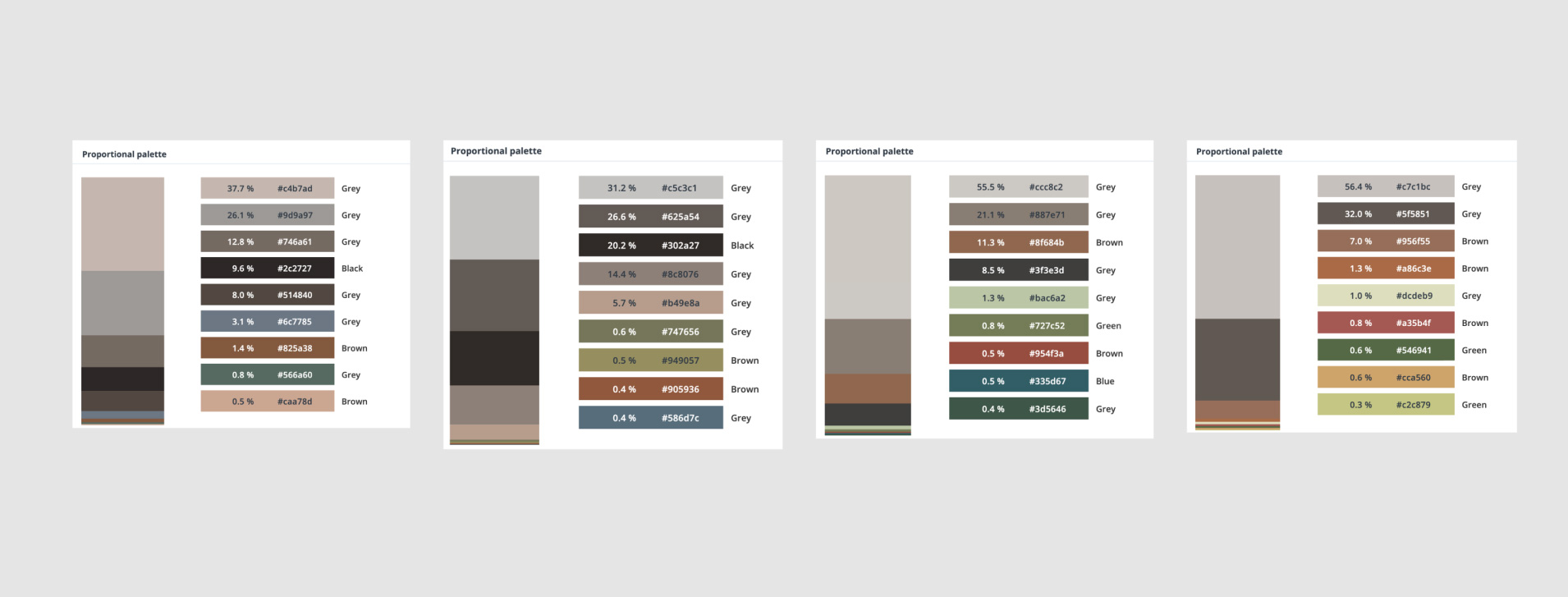
Still, some colors were almost identical in hue, saturation, and lightness, e.g., the blues extracted from best-in-class and professional were similar, the same with the greens on practical and approachable. In the end, I used six colors, normalized their lightness to 50%, and created eight shades for each of them.
Color palettes and shades
I would decide on which colors to use once I made some tests in a high-fidelity mockup.
Illustration style
At this point, I had already defined the color palette and the font families. It was time to explore the style of the graphics. I decided to start with the illustration for the hero of the new website. In this graphic, I wanted to somehow represent the value proposition of our product – a freelancer focused on their work while having Buholá taking care of the rest.
The Utopia STD would be the font I would use for the main headline. To contrast with its "formality," I thought of creating a hand-drawn illustration on the iPad. In my mind, the friendliness of the illustration and the seriousness of the font would make a good combination.
First exploration for the graphic on the hero
The combination of colors worked, but the illustration was too cartoonish, so I decided to try a different visual style. Although I'm not an expert in 3D illustration, I managed to create something pretty decent in Cinema 4D.
Second and final exploration
Marketing Website
Next, I worked on the layout and content of the website's home page in lo-fidelity. I iterated with the support of my partner and then worked on the mockups.
This was the final result of the design.
Final mockup of the company website
In the end, I used two colors as primary and secondary, plus one more color for accents.
I implemented the new design in Webflow. I applied the color palette to the Global Swatches to reuse them across the different components. Webflow allowed me to create a responsive home page optimized for SEO quickly. It also gave me the possibility to add a blog in the future.
Weblow project for the website
Along with the website, we launched a marketing campaign on Facebook using our color palette and most of the graphic elements.
Graphic assets for Facebook campaign
Implementing the look & feel on the product
As the last step, I applied the new color palette to our product. Although I still needed to adapt some graphics to the new look & feel, changing the colors and fonts was enough already to provide visual consistency.
Look & feel of the product after applying the new color palette
Outcomes
The look & feel was in line with what the team wanted to transmit, and the work done was enough for us to revamp our website and launch our next campaign on time. We are currently measuring the results of this campaign against the previous ones to get a sense of whether the revamp was helpful on that front.
Next steps
We will adapt the rest of the graphics across the product and those used for transactional emails. We will also run a study to test whether the new visual style communicates the right attributes to our audience.