Designing a social media app for a Mexican University
Designing a social media app for a Mexican University
From doing generative research to designing and delivering a robust set of functionalities.
Case study
June 24, 2018
My role
Product Design Lead & Researcher
The activities
Qualitative research, Interaction design, Product management, Stakeholder management, Facilitation, User interface design, and Teaching
The team
Project manager, Delivery Manager, Engineering Team, and Design Team
The tools
Mural, Whimsical, Sketch, Zeplin, and Google Docs
Overview
A prestigious University from Mexico approached us to partner and get support on their "Digital Transformation" strategy. The project they envisioned included the design and development of an app that would serve as the central hub for both students and professors. Some of the functionalities:
Create groups and chat rooms
Make announcements
Address administrative matters
Provide training and learning opportunities
This app would also replace legacy systems that were no longer addressing the University's needs and goals.
We assigned a multidisciplinary team to work on this project for which I drove the Product Design and Research efforts and collaborated with other team leads in the process - project management, engineering leads, account executives, and sales.
Goal
Deliver a successful digital experience for students, so they have a centralized place to manage their information, interact with other students and professors, consume learning content, and receive mentorship.
Challenge
Evangelize the stakeholders, who have historically worked on waterfall processes, closer to our agile methods, and shift their mindset towards a continuous learning approach to focus on delivering value over building a pre-defined list of features.
Process & Solution
This project was challenging because although we knew there was no obligation to deliver a specific list of functionalities, our client had a very well-defined list of features in their mind and was used to doing things in a rigorous way. At the same time, they wanted to learn from us on how to do user-centered design, adopt an agile mindset, and bring these new ways of working to the rest of the organization.
These two directions were conflicting but also linked: we knew that we would need to influence their way of thinking on the first one to do the second one. We decided that before kicking off the project, we needed to start with a few weeks of training onsite with their team.
Training
I traveled along with one Design Manager to provide training for three days on the following topics:
What is User Experience and User-Centered Design
UCD common activities and artifacts – user research and validation, sketching, wireframing, and prototyping
Empathy and emotional design
User research process, methods, and archetypes
Ideation methods
Interaction design principles
Prototyping and validation
We presented examples of how we have implemented these methods in the real world and got our students working on familiar scenarios while putting these activities into practice. After us, peers from other disciplines (engineering, data, project management) visited our stakeholders to provide training as well.
At the end of these sessions, our stakeholders were ready to learn through execution, so we decided to kick off the project.
The project plan
The project started with me as Design Lead along with one Interaction Designer, one Visual Designer, a Project Manager, a Delivery Manager, and a small engineering team who would be doing technical research while we focused on user research and re-defining the scope. The engineering team substantially grew as we moved from discovery to execution.
We kicked off the project with user research to let our users dictate what was necessary. These are the steps we followed across the project:
Generative user research to spot the most relevant user needs and goals
Scope definition
Brand Distillation and definition of the look & feel
Whiteboarding sessions
Visual design
Prototyping & validation
Handoff to development
Step 3 ran in parallel with steps 4 to 7, which, at the same time, ran in iterative cycles as we designed every feature.
My role as Lead Designer
I spent 50% of my time on this project for six months, which is typically the time a Design Manager spends on critical projects for the company. With the other 50%, I managed ten direct reports and executed on other internal activities, such as hiring. These were my responsibilities on this project:
Define, direct, and run generative and evaluative research with the support of two designers
Lead strategy workshops to define the scope of the project
Lead whiteboarding sessions to land the interaction and user interface design of the application
Collaborate and bring in team leaders into conversations to set direction and remove blockers for design
Lead demos and design presentations
Ran design reviews to provide feedback and iterate on interaction, user interface, and visual design
User research
Three of our stakeholders were heavily involved in this phase. They recruited students and professors, and we ran the studies with them, they were note-takers but also interviewed a couple of users – they saw this project as a learning experience, so we got them involved and coach them as much as possible.
Also, they had already gathered much information through informal interviews and surveys, so we poured all that information into proto-personas. We reviewed the information they had documented and extracted data during a couple of workshop sessions that helped us put together these archetypes.
The interviews
While our peers/clients helped us recruit users based on the proto-personas, we created interview scripts that included a combination of open-ended questions and behavioral variables. The variables were focused on activities, attitudes, motivations, and skills and were extracted from the information we had, which helped us create spectrums to map our interviewees across.
Some of the variables used for the study
During the interviews, every note-taker had a printed copy of a template to take notes on the open-ended questions and map our interviewees across the variables. This process helped us to optimize the synthesis phase later. We interviewed ~60 people, around 15 per proto-persona, which was more than enough to create the first set of personas.
Personas
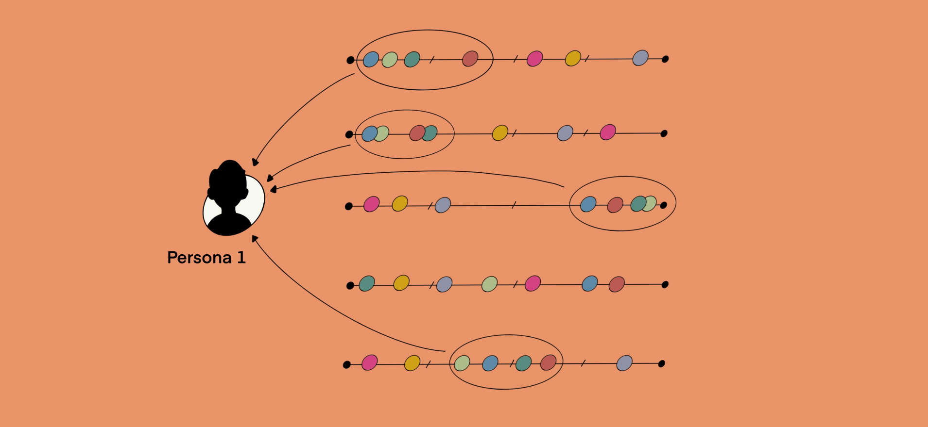
We followed Copper's approach to creating personas, a process that is also documented in Designing for the Digital Age by Kim Goodwin. We optimized it a little bit though, by using some digital tools: 1. In Sketch, we created four boards (one per proto-persona). We mapped our interviewees across each of them and assigned one color to each interviewee to identify them across the variables in the board.
Interviewees mapped across variables based on their answers
2. Then, we identified clusters across the different variables – the users that grouped across more than four variables indicated a potential persona to us.
Interviewees grouping across variables
3. We added insights from our notes above each cluster. An insight could be a specific description or quote indicating a the behavior, a pain point, or a goal. Goals could be explicit (what the user directly told us during the interview) or inferred from their behaviors, pain points, or other goals.
Insights linked to clusters across variables
Sketch boards with clusters identified during debrief sessions
4. We classified the goals per type:
Experience goals: how users want to feel about the current state of experience, e.g., feel in control
End goals: the specific tasks users want to accomplish, e.g., find problems before they are critical
Life goals: who the user wants to be, e.g., be popular
Each type of goal informs decisions not only for the product but also for marketing campaigns or sales pitches.
5. Lastly, we put together the archetypes.
First set of personas
We presented our personas and the process we followed during one of our bi-weekly demos and continued referencing our personas by their names across the rest of the project.
Scope definition
At this point, we already had a clear idea of what the business wanted to accomplish. It was time for us to bring in the users' needs to clear up assumptions, and get together to define priorities. The main challenge was that our client had a 6-month time frame to deliver the first version of the product and the number of features they had in their mind were too many for the team to deliver all of them on time.
User story mapping
For the next activity, I decided to go with Jeff Patton's User Story Mapping. This method allows teams to shape minimum viable products (and subsequent phases) in detail using sticky notes and any available wall (a 20 x 9 feet wall, in this case). I spent three days with my team and our clients in a meeting room, mapping everything we needed to do based on what the business needed, what our personas needed, and what the technical team thought might be viable to implement phase by phase. The following is a picture of how the map looked like at the end:
User Story Map created during three days
Non-negotiables
Before the project started, our clients had meetings with different business units to define the list of features they wanted to include in the product. Although they showed interest in being agile and recognized that some of the features would not meet any of our personas' needs or pain points, it was complicated for them to leave things out or push things for later without getting in trouble with their peers and leaders.
Despite of that, we knew we needed to work incrementally and ship a minimum viable product before the first deadline. I decided to split the scope into shorter increments and spot the areas with more uncertainty for us to research and come back with more solid answers in terms of feasibility. These were the outcomes of our workshop:
A list of epics and stories for a first version
A set of features for which the technical team would do some research and come back with more information on whether it would be viable to include them in the roadmap
The risky assumptions associated with some features in the board and that we wanted to validate first before defining whether they would be relevant for the MVP
The user story map was revisited throughout the rest of the project and more often as we got closer to our deadline. It evolved as we moved forward, and as we moved forward, certain features became more relevant than others, which helped the team focus on what was more important.
Branding
We started working on two tracks from this moment: the first one focused on the brand attributes, style tiles, and component library, the second one focused on the interaction design through user flows, sketches, and prototypes. At some point, these two would meet but were not dependent on each other at the beginning.
For the first track, I invited one Design Manager expert in branding who ran a few sessions with two of our stakeholder. He used a digital version of the brand deck to run a workshop, extracted brand attributes, and created a couple of proposals for style tiles. The style tiles were iterated a couple of times and then delivered to our Visual Designer. He used that visual direction to create our component library, starting with the atoms (buttons, badges, input fields, etc.) and then adding molecules as we defined the components in the user interface.
Digital version of the Brand Deck created by the Visual Design Team
Product design
We followed an iterative process, involving different stakeholders at every step to avoid as much waste and rework as possible:
User flows
User flows described the high-level interaction before moving to screens. These were reviewed, iterated, and even co-created with our Technical Lead and Project Manager. We often spotted technical or business-related questions for which there was not an answer yet; they would spend a day or two figuring things out things for us so we could iterate and move forward. This step was crucial for us to clear up dependencies early in the process.
User flows describing the interaction of the whole application
Whiteboarding sessions
Here we explored the interaction on a deeper level, the layout, the components, the copy, and the microcopy. The Interaction Designer, the Visual Designer, and the Technical Lead participated in these sessions. These "wireflows" helped the Visual Designer to identify components to add to the component library. They also allowed the engineering team not to "feel blocked" by designers – they already had a picture of the user flow screen by screen with their components and layout. They could start focusing on the functionality without waiting for "final mockups."
A few pictures of some of the whiteboards from our sessions
Visual design
After the whiteboarding sessions, the team split and worked on different streams. Our Visual Designer created high-fidelity mockups while the Interaction Designer updated user flows or created prototypes for user testing. Our Product Owner would reviewed these mockups and provided feedback on copy and microcopy, especially for those screens related to regulatory terms and industry jargon.
Prototyping and validation
We designed prototypes with two different purposes: to accurately showcase the work done during demos with our clients and to validate our features during usability studies. We ran a total of five usability studies on this project, one per epic. We recorded every session and had workshops to debrief on the insights. This is what we did during these sessions:
We used Mural to dump every insight into the board (one insight per sticky note)
We organized insights in a grid: one row per user, one column per task
We color-coded the insights: green for positive, orange for negative, and blue for general comments
We included our recommendations around the next steps in the last column
During each end-of-sprint demo, we presented our insights and recommendations. During the next sprint planning, we discussed potential changes by considering the impact on the user experience and the timeline.
Debrief board with insights categorized after a research study
This continuous cycle of user flows > whiteboarding > visual design > prototyping > validation was not linear. As we moved forward, the focus was less on the user flows (mostly defined) and more on the visual design. Based on new findings, we also revisited flows and screens that we had already delivered. It was key for us to show pragmatism and focus on the value we wanted to deliver.
Outcomes
Client
Adjusting the scope and prioritizing to meet the deadline was the topic we brought up with almost every sprint. It is essential to mention that although the team delivered a product that we felt confident would meet user and business needs, it was difficult to please every stakeholder regarding the functionalities they wanted to see in the application. From my point of view, we had two primary goals in front of us when we started this project:
Deliver a seamless user experience for end-users
Help our client understand the ins and outs of doing agile design and development
The first goal was accomplished, for the second one we will need more time and practice to get there.
Business
This project opened the door for two more projects that started shortly after working on this project. The expertise and the confidence this team showed helped to build trust in our client.